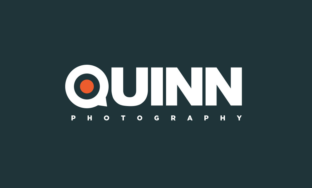
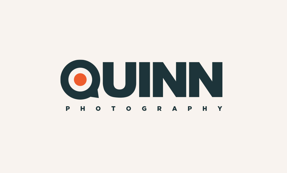
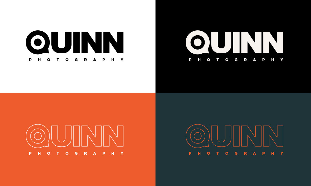
Logo design & branding for Jim Quinn
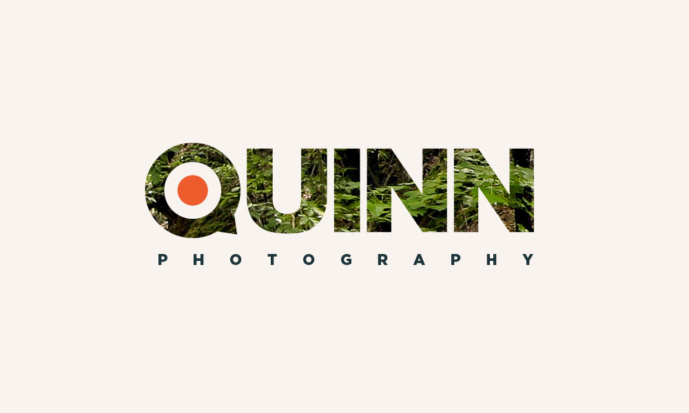
For many years, Jim Quinn was a photographer for the Chicago Tribune. Upon his retirement, he began a freelance photography career for which he needed a logo and some branding materials. This was one of a few different options I presented to him. The stylized letter Q alluded to a bird's head as the inspiration came from the old phrase, "watch the birdie." The Q was also intended to symbolize a camera dial, with the orange dot in the center representing the button you'd press to take a photo.